⚠️
Academic project only This is an independent UX/UI case study. I have no affiliation with Valve Corporation or Steam. All brand assets belong to their respective owners.
UX/UI Case Study
Independent Research — No Affiliation with Valve

Steam Website Redesign.

Platform
Steam / Valve
Type
UX/UI Redesign
Designer
Nikol Kovanyov
Focus
Web · Desktop
Scroll

Overview

The world's
largest gaming
platform.

Steam is a digital distribution platform developed by Valve Corporation — the most popular and widely used platform for purchasing, downloading, and playing video games on PC. With over 50,000 titles and 132 million active users, it's an ecosystem as much as a storefront.

Despite its dominance, Steam's interface has accumulated years of visual debt. This study examines the platform's UX failures and proposes a redesign that respects power users while welcoming new ones.

UX Research UI Redesign User Personas Competitive Audit

Product Value

What we set out
to fix.

Primary Goal
Onboarding & Navigation
Ensure that new users can easily create accounts, navigate the interface, and understand the platform's features without friction or confusion.
Secondary Goal
Game Detail Pages
Improve the design of game detail pages, making it easier for users to gather information and make confident purchasing decisions.

Problems

Where Steam
loses users.

🔍
Discoverability & Exploration
Users find it challenging to discover new and relevant games due to the sheer vastness of the Steam catalogue. The recommendation engine surfaces obvious choices, never serendipitous ones.
🌊
Information Overload
Users struggle to make informed decisions due to incomplete or overwhelming game information. Store pages mix marketing copy, technical specs, reviews, and DLC offers without clear hierarchy.

Research Methods

How we
gathered insight.

17
Surveys completed
2
In-depth interviews
2
User personas built
3
Platforms audited

Research Results

What 17 users
told us.

0%
of users struggle
with game detail pages
0%
start every session
from the home page
0%
use Discord instead
of Steam Chat
Finding 01
"Most people face
difficulties on game
detail pages"
Details page
42.9%
Home page
28.6%
Categories
14.3%
Other
7.1%
Finding 03
"Most prefer Discord
over Steam Chat
for social gaming"
Discord / other
80%
Steam Chat
20%

User Personas

Who we're
designing for.

K
Kassandra
"Enjoys playing games to relax and unwind"

Kassandra is a 26-year-old teacher who considers herself a casual gamer. She prefers games with engaging stories and easy mechanics, and often uses Steam to discover new titles that match her preferences.

26 years old · London, England
Teacher in elementary school
Married, with a cat
Game preferences
Story-driven Casual Puzzle
"I often feel overwhelmed by the sheer volume of games available on Steam."
A
Alexios
"I love games with adrenaline where you have to think fast"

Alexios is a 32-year-old software developer and hardcore gamer who enjoys competitive multiplayer and complex RPG narratives. He also develops indie games as a side project, giving him a technical perspective on platform UX.

32 years old · Mykonos, Greece
Software developer
Single
Game preferences
Multiplayer RPG Competitive
"Forums and community features are hard to find — it's difficult to connect with fellow enthusiasts."

Benchmark

3 competitors,
one clear gap.

Xbox, Ubisoft, and PlayStation Store were each audited across four UX dimensions. The goal: find the patterns worth borrowing and the mistakes worth avoiding.

xbox.com/games/store
bm-xbox screenshot
Xbox Store
Navigation
8.5
Discovery
7.5
Product Page
8.0
Visual Design
9.0
Game Pass creates a single clear CTA — zero decision paralysis.
Clean dark UI with consistent card sizing throughout.
Search is hidden behind an icon — not immediately visible.
Filter system is limited compared to Steam's depth.
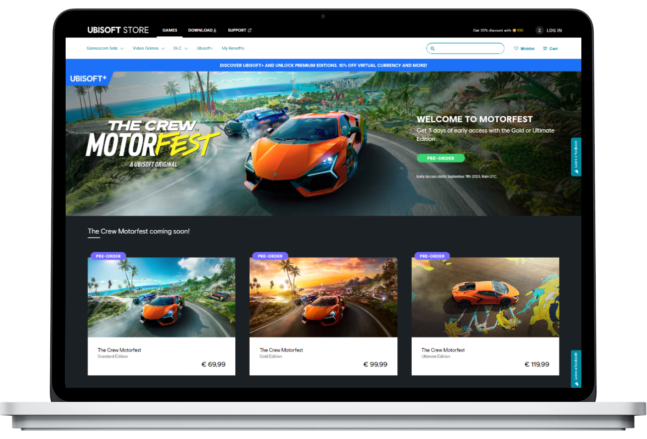
store.ubisoft.com
bm-ubisoft screenshot
Ubisoft Store
Navigation
7.0
Discovery
6.5
Product Page
7.2
Visual Design
7.8
Visible search bar in nav — best discovery entry point audited.
Category filter bar is fast and accessible without page reload.
First-party only — no ecosystem breadth beyond Ubisoft titles.
Ubisoft Connect requirement creates friction at checkout.
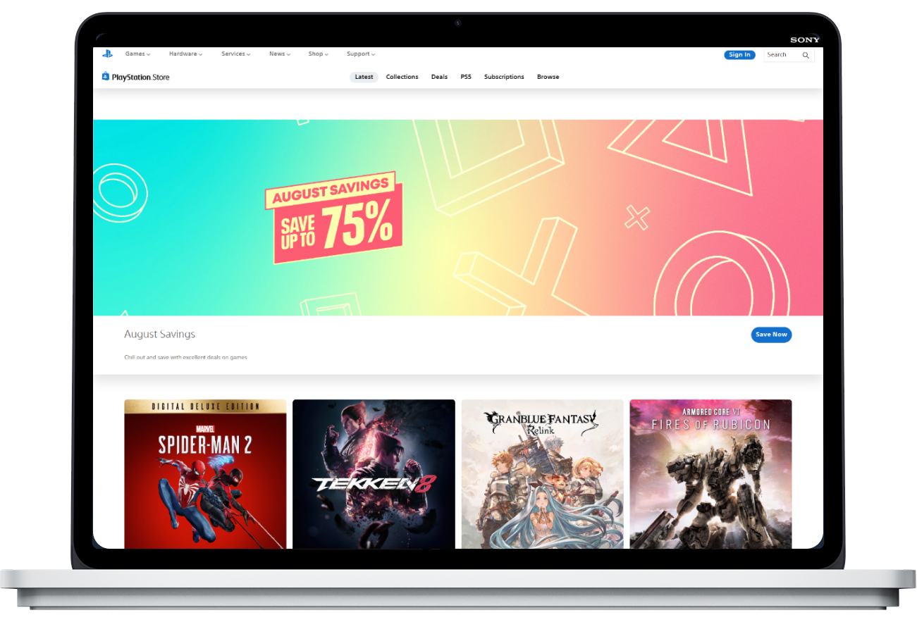
store.playstation.com/en-il/pages/latest
bm-psp screenshot
PlayStation Store
Navigation
8.0
Discovery
7.5
Product Page
8.5
Visual Design
8.8
Best product page layout audited — hero, buy panel, details in order.
PS Plus integration with clear value at every touchpoint.
Recommendations feel generic — no visible user preference signal.
Region restrictions create inconsistent global experience.
At a glance — how they compare
Xbox
Ubisoft
PlayStation
Steam (target)
Navigation
Discovery
Product Page
Visual Design

Conclusion

The brief
distilled.

Steam suffers from overwhelming visuals, unclear call-to-action elements, and deep inconsistency across its interface. The platform would benefit from a comprehensive review focused on simplifying navigation, improving information hierarchy, and ensuring a seamless, responsive experience across devices.


Wireframes

Structure before
aesthetics.

Low-fidelity wireframes established information hierarchy and user flow before any visual decisions were made.

01
Home Page
Hero carousel · Special Offers · Browse by Genre · Community
02
Product Page
Hero + CTA above fold · Edition cards · Screenshot gallery
Home Page
Home Page Wireframe
Home Page Wireframe
Product Page
Product Page Wireframe

Prototype

Before & after —
three screens.

Each redesigned screen directly addresses a pain point identified in research. Tap the tabs to switch between screens.

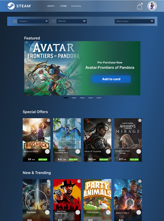
Problem

Information overload on the homepage — too many competing sections, no clear entry point, sidebar clutters navigation.

Solution

Single hero carousel with one CTA, clear section titles, cleaner card grid — every section has one job.

Before
store.steampowered.com
Old Steam Home
After
steam.com — Redesign
New Steam Home
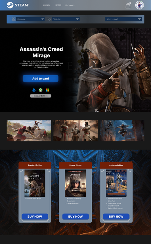
Problem

Product page buries the buy button under promotional content. Edition comparison is hidden, system requirements unclear.

Solution

Hero + Add to Cart above fold, screenshot gallery, edition cards (Standard / Deluxe / Collector) side by side — everything visible without hunting.

Before
store.steampowered.com/app/...
Old Product Page
After
steam.com — Product Page
New Product Page
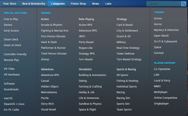
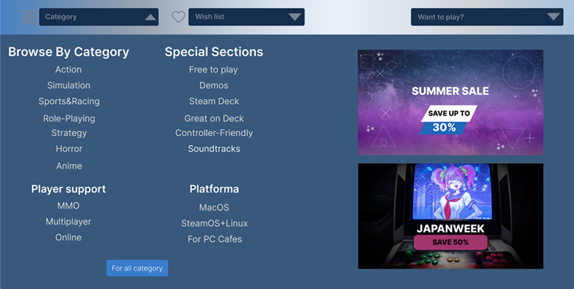
Problem

Mega-menu overload — 100+ category options visible simultaneously with no visual hierarchy. Users feel lost immediately.

Solution

Curated dropdown with grouped sections — Browse by Category, Special Sections, Platform — fewer choices, clearer structure, visual banners for promotions.

Before
store.steampowered.com — Categories
Old Categories
After
steam.com — Categories
New Categories
See the full flow.
Interactive prototype — all screens, all transitions.
Open Prototype

Like what you see?
Let's work together.

Get in touch ← All projects